Excel Timelines: The Most Underrated Tool for Interactive Reports
Oct 20, 2025
When analyzing data in Excel, we often want to see how performance changes over time; by month, quarter, or year.
Most people rely on filters or dropdown menus to adjust their date ranges, but there’s a simpler, faster, and more visual way: Timelines.
If you already use PivotTables, adding a Timeline can instantly make your reports more dynamic, interactive, and easy to explore.
What Is a Timeline in Excel?
A Timeline is a visual filter that works exclusively with date fields in a PivotTable.
It lets you scroll, drag, or click through specific time periods — so you can instantly see how your data changes over days, months, quarters, or years.
Think of it as a date slicer, but smarter.
How to Insert a Timeline
It only takes a few clicks to add one to your PivotTable:
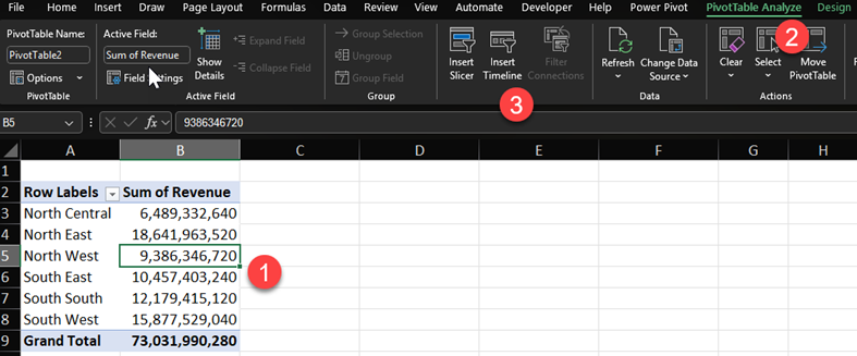
- Click anywhere inside your PivotTable.
- Go to the PivotTable Analyze tab on the Ribbon.
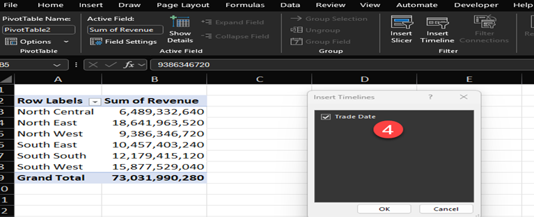
- Select Insert Timeline.
- Choose the date field you want to use — for example, Order Date or Transaction Date.
- A timeline will appear on your worksheet, ready to use!
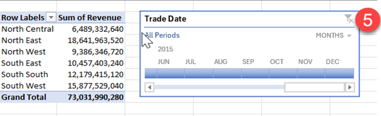
Now you can filter your PivotTable just by dragging or selecting the time periods you want.
How It Works
Each block on the Timeline represents a time period (month, quarter, or year).
You can switch between these views easily using the dropdown arrow on the top-right corner of the Timeline.
Click or drag across the timeline to select a range.
Your PivotTable updates instantly, showing only the data for that time period.
Why You Should Use Timelines
Timelines are perfect when your data involves dates or periods — like sales over time, attendance, production output, or expenses.
Here’s why they’re worth adding to your reports:
- Visual control: No dropdowns; just click and drag.
- Speed: Filter months, quarters, or years instantly.
- Clarity: Your viewers can see which time period is currently selected.
- Professional dashboards: Combine timelines with slicers for sleek, interactive reports.
Conclusion
Timelines are one of Excel’s most underrated features; often overlooked but incredibly powerful.
They turn static PivotTables into interactive, time-driven dashboards that anyone can navigate easily.
Next time you create a report with date data, skip the old dropdown filters.
Instead, add a Timeline and let your audience experience your data in motion.

