Make Your PivotTables Easier to Read with the Right Report Layout
Oct 20, 2025
When you create a PivotTable in Excel, the default layout is usually Compact Form; but have you ever noticed that it sometimes makes your data harder to read?
That’s where Report Layouts come in. Excel gives you three layout options — Compact, Outline, and Tabular and choosing the right one can make your PivotTable reports much cleaner and easier to interpret.
Let’s compare the two most popular ones: Compact and Tabular.
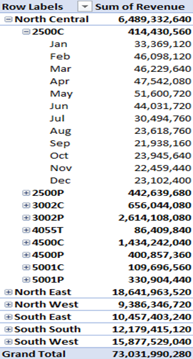
- The Compact Layout
Compact layout is the default PivotTable format. It stacks multiple row fields into a single column, making your PivotTable look “neat” but often difficult to filter or copy.
Example:
Pros:
- Saves space; it is good for quick summaries
- Keeps reports narrow and clean looking
- Great for dashboards and small data summaries
Cons:
- Harder to read when you have multiple row fields
- Can’t easily use filters or slicers on individual fields
- Not ideal if you need to export data or reference it in formulas
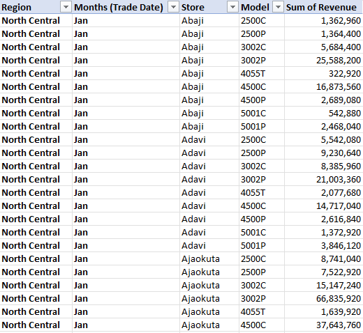
- The Tabular Layout
Tabular layout displays each field in its own column, making it easier to read, analyze, and copy to other sheets.
Example:
Pros:
- Each field has its own column, super great for readability
- Works well for data export or further analysis
- Cleaner structure when using multiple row fields
- Perfect for reports that will be printed or shared
Cons:
- Takes up more horizontal space
- Not as visually compact as the default view
How to Switch Between Layouts
You can easily change your PivotTable’s layout in a few clicks:
- Click anywhere inside your PivotTable
- Go to Design → Report Layout
- Choose:
- Show in Compact Form
- Show in Outline Form
- Show in Tabular Form
You can also check “Repeat All Item Labels” to make Tabular layouts more readable.
Which Layout Should You Use?
- Use Compact Layout for quick summaries and dashboards where space is limited.
- Use Tabular Layout for reports, data analysis, and presentations that require clarity and structure.
If your goal is clarity over compactness, Tabular wins every time.
Conclusion
PivotTable layouts may seem like a small detail, but the right layout can completely change how your audience interprets your report.
The next time you build a PivotTable, don’t just accept the default; experiment with Compact and Tabular layouts and see which one best fits your reporting goal.

